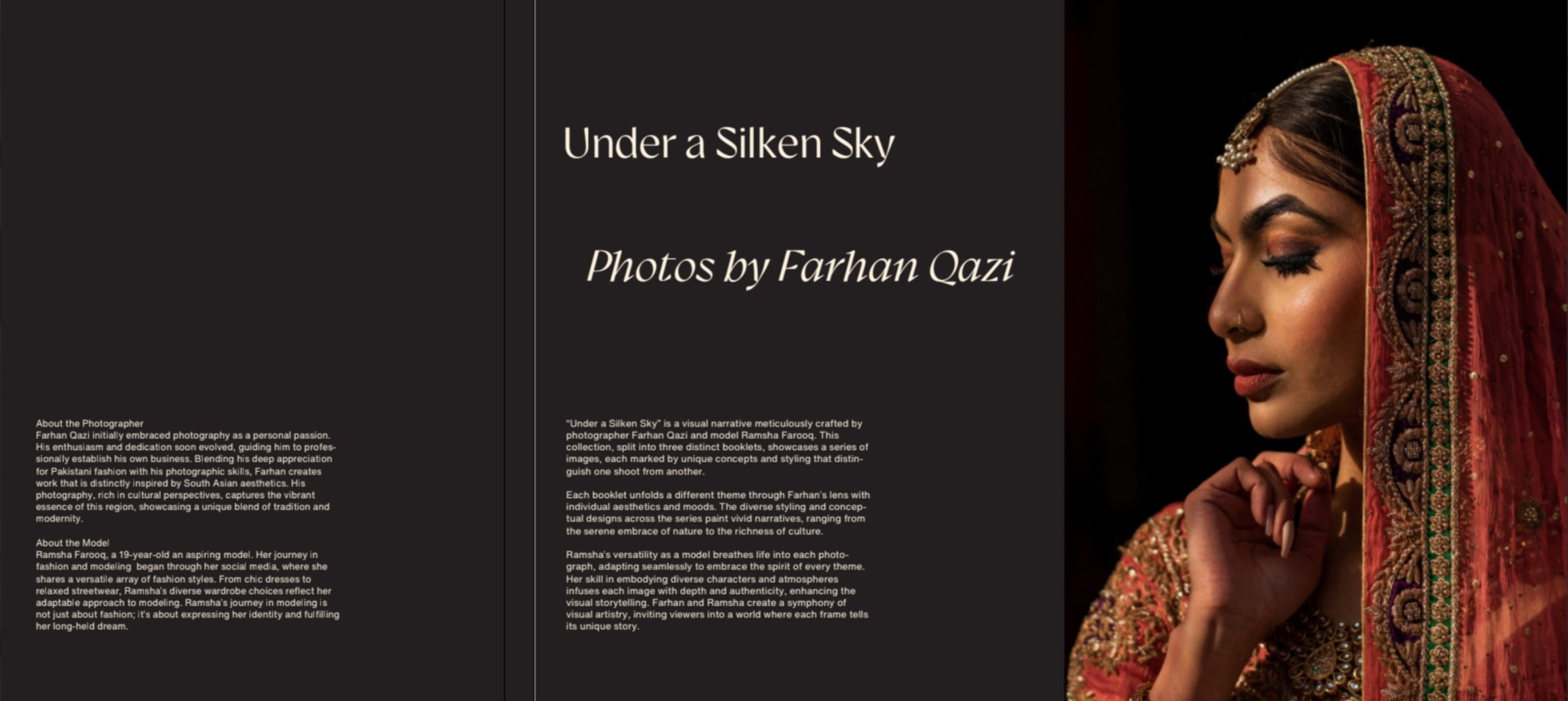
Photography Book Design
UNDER A SILKEN SKY
05/12/23
YORK UNIVERSITY
Designing a photography book demonstrating the transformative power of styling, posing, and location in creating diverse aesthetic experiences within conceptual photography. By using a single model across three distinct booklets, the project aims to showcase the dynamic range and versatility of visual storytelling, ensuring that the supporting typography complements, without overshadowing, the impact of each photograph.
Project Overview
For my second-year Communication Design project, I was tasked with creating a book from a list of randomly assigned titles. I chose "Under a Silken Sky," inspired to craft a book concept that encapsulated stories told through evocative photography with themes of love and romance. This four-week endeavor allowed me to explore the intersection of narrative and visual design, culminating in a book that combined rich imagery with thoughtful typography to enhance the storytelling experience.
Theme Selection
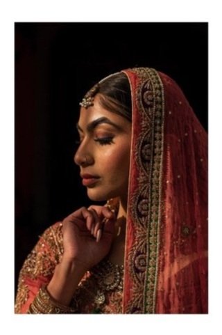
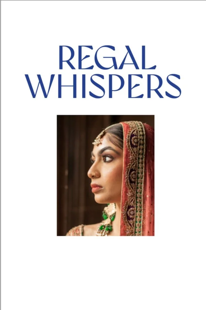
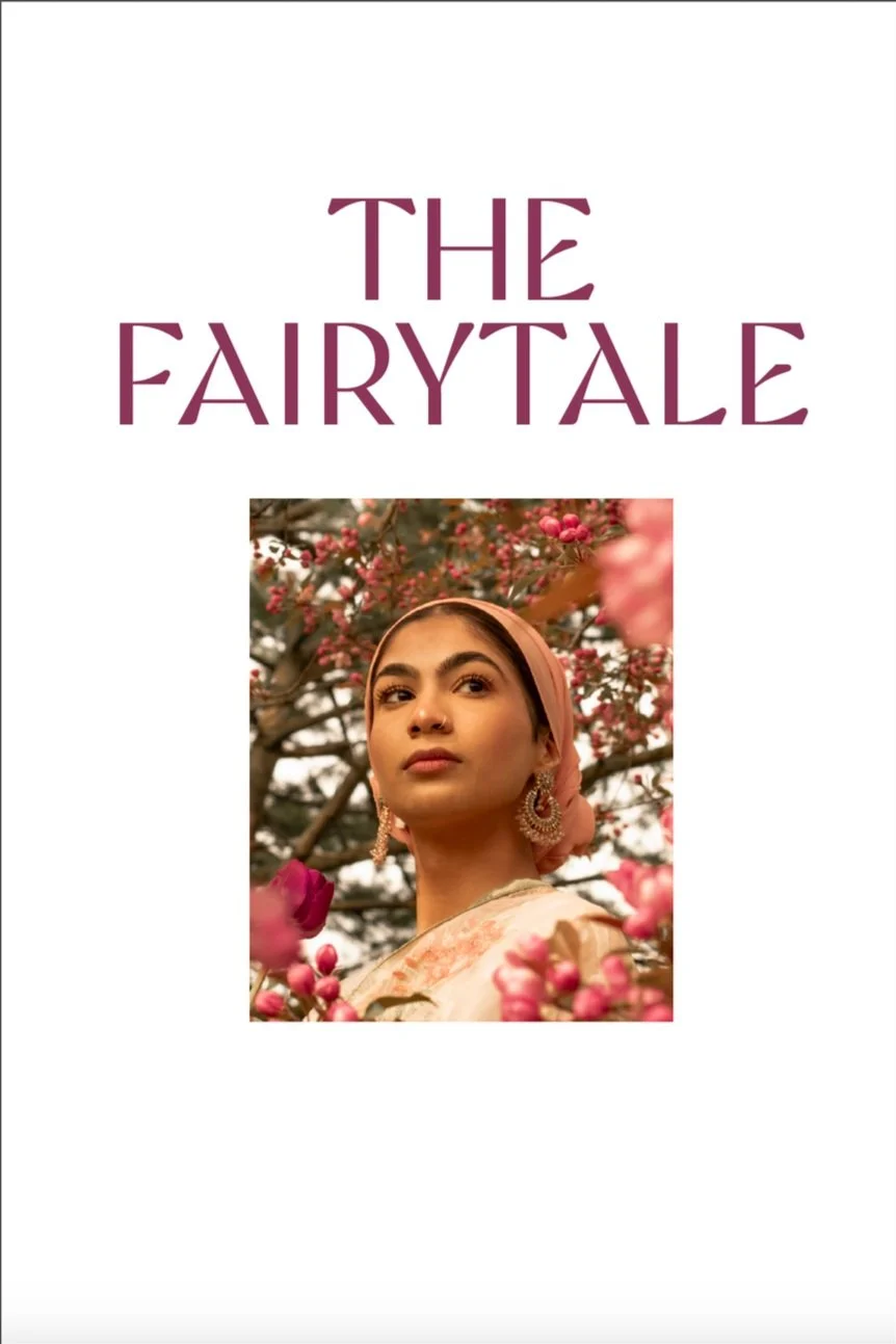
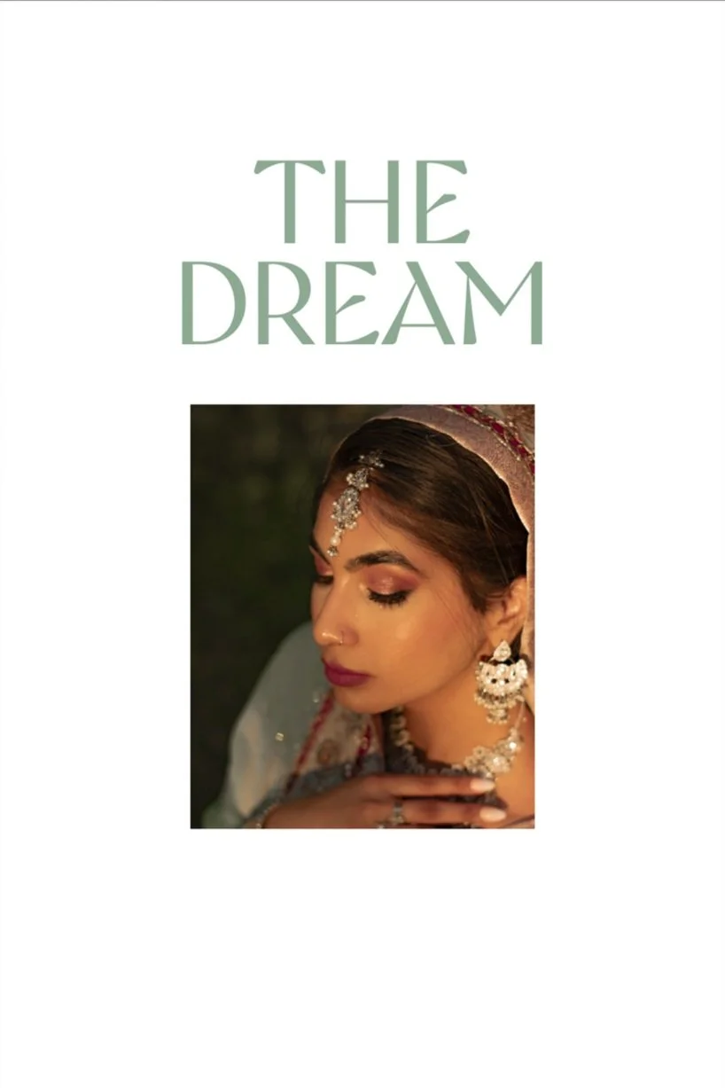
Each of the three booklets—"The Fairytale," "Regal Whispers," and "The Dream"—was developed to explore different facets of romance and storytelling through visual imagery. "The Fairytale" focused on purity and simplicity, using the backdrop of cherry blossoms to convey a narrative of new beginnings and enchantment. "Regal Whispers" portrayed a more introspective and solemn narrative, encapsulating the elegance and hidden stories within moments of quiet majesty. "The Dream" aimed to capture the essence of aspirations and the ethereal quality of hopes woven through the delicate threads of reality.
Booklet 1
Color and Mood
The choice of a dominant color for each booklet was informed by the predominant tones in the photo shoots, with the intention of enhancing the emotional impact and thematic depth. Each color was selected not only for its aesthetic value but also for its ability to evoke specific feelings associated with the stories being told.
Strategic use of color blocking was employed to highlight key text elements and to draw attention to specific parts of the narrative. This technique helped to balance the visual dynamics of the page layouts, ensuring that the text did not overpower the imagery but rather enhanced the storytelling.
Booklet 2
Prototyping and Iterations
Early prototypes of the booklets were created to test layout configurations, typography settings, and the interplay of text and image. Feedback from these prototypes guided refinements in design, leading to adjustments in text placement, color use, and the overall pacing of the visual narrative.
Typography and Layout
The selection of Gyst Variable as the primary typeface was driven by its modern and adaptable qualities, which complemented the artistic direction of the booklets. The typeface facilitated a variety of layouts, from elegant and sparse to rich and detailed, allowing the text to flow seamlessly with the imagery.
Material Selection
The paper chosen for the booklets was crucial in capturing the right texture and weight to complement the visual and tactile experience of the reader. The use of tea-stained and high-quality paper enhanced the vintage and romantic feel of the photographs, adding a layer of depth and immersion to each page.
Booklet 3
The "Under a Silken Sky" book series, crafted in Adobe InDesign, exemplifies my capability to blend narrative depth with sophisticated visual design. This project, through its trio of thematically rich booklets, underscores my proficiency in using advanced design software to execute complex layouts that enhance photographic storytelling. Reflecting on this endeavor, I value the personal and professional growth it fostered, fueling my passion for exploring the dynamic interplay between design and photography in future projects.